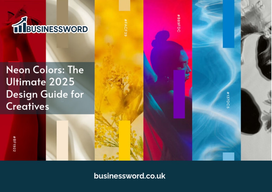
Neon colors are the trend in design today, and they’re brighter than ever. These bright shades can sparkle in neon through the likes of websites and adverts to product packaging and social media graphics. Whether you are an experienced designer or an inventive newcomer, applying neon colors properly in a design would seriously add unparalleled interest and appeal.
The ultimate 2025 guide breaks everything down about neon colors into what they are, where they come from, the do’s and don’ts of using them, and everything else you need to know.
Neon Colors Definition
Neon colors are blindingly bright hues that dominate in any given visual field. They were originally thought of in association with neon signs, but they give the impression of an artificial glow even in digital or print. Here are some of the best-known neon colors:
- Neon pink
- Neon green
- Neon yellow
- Neon blue
- Neon purple
These shades have a huge visual punch. Bright neon colors derived from glass tubes filled with electrically charged noble gas, on the other hand, refer to computer-generated bright colors that are at the maximum RGB or CMYK values. The resulting synthetic look is vibrant with a life of its own on-screen or in print.
Neon Colors History
The history of neon colors can be traced to the invention of neon lighting in 1910 by French inventor Georges Claude. Neon lamps were already gracing the streets of Paris by 1912, and by mid-20th century, they began to decorate the nightlife culture of the urban settings, particularly in cities like Las Vegas and New York.
The arrival of neon in design and fashion, however, took place in the 1960s, during the Pop Art period, when artists and designers embraced loud, bold colors. The 1980s and 1990s witnessed a spectacular return of neon colors in fashion, music videos, and pop culture-rave parties, aerobics gear, and MTV graphics come to mind. Today, neon colors are becoming trendy again in 2025, revived by digital arts, aesthetic trends of social media, and futuristic branding styles.
Why Use Neon Colors in Design?
They are all neon, bright, lively, exciting, and modern naturally. This is why you need neon, when it should be used:
- To grab attention in ads, banners, or social posts,
- Evoke excitement for a concert, festival, or event with lots of energy.
- Attract kids or adolescents, especially Gen Z.
- Initiate calls to action within the website or application.
- Emboss the neat tech edginess of lifestyle brands or products.
Neon pops everything out: be it a mobile app or flyer or product label a pinch of it will surely sure make attract at the right places where it’s most necessary.
When to Avoid Neon Colors
They are eye-catching hues, but they are not for every project. Used in the wrong context, they can easily verge on awful, garish, or just unprofessional. Therefore, this is when neon shades ought to be kept away from:
- Corporate or formal branding such as law firms, hospitals, and finance
- An audience for whom any hue should be muted and elegant: 40 and more
- Complex infographics that need easy-going, neutral tones for readability
- Serious subjects-the law, the finance, the medical
Even too much neon like neon text on a neon background—can overwhelm the viewer and obscure your message. Short story: decide wisely when to apply neon colors.
Best Neon Color Combinations
It is important to pair neon hues with contrasting neutrals or other complimentary tones as they bring out the very best in each other. Here are some combinations that work almost always:
- Neon Yellow + Charcoal: Bright and lively against a deep charcoal background, perfect for an athletic brand or technology.
- Neon Green + Black: Strong black and neon green combination, usually applied to very bold games, music, or grimy fashion. A true streetwear and diehard underground poster combo brings to mind.
- Neon Blue plus White: The perfect combination to showcase high-tech and cleanliness; ultra-modern for UI solutions, app designs, or websites.
- Neon Pink + Royal Purple: Ideal for a younger audience event, it can also be used in musical festivals or trendy campaigns. Loud but fun; think of it as a happy mix of 80s and 90s.
- Neon Gradients: Blend two or more neon colors in a gradient to create depth and movement. A neon gradient background can bring energy to posters, social ads, and product packaging.
Neon Color Combos to Avoid
Not all juxtapositions with neon shades are blessed. Some do edge on the overwhelming, while others clash instead of contrast. Avoid:
- Neon red + neon green Sinful to the eyes.
- Neon yellow + neon pink Too lacking in contrast, as both are equal in brightness.
- Neon text on a neon background is a guaranteed recipe for readability failure.
- Over Two Neon Colors in Any Layout Strangely violent to the eyes.
So use only one or two neon accents to have the maximum punch.
How to Use Neon Colors Effectively
Bright neon colors were sure to put any project on edge if it themselves would use the color artfully. Learn from experts on the following ways to use neon colors in your work:
Neon as an Accent Color:
Neon is not there to compete with the message, it’s there to highlight it. Consider using neon for:
- Buttons and calls to action
- Headlines and subheads
- Borders and Outline
- Icons or data points of interest
- Calendar dates or times of events.
Not a whole layout with neon; think of it as the spotlight.
Pair Neon with Dark Backgrounds:
Darker background makes neon colors shine best. Try matching neon with:
- Black
- Deep Navy
- Charcoal Gray
- deep purple
- slate tones
All of them are actually creating a very good visual balance to the eyes without tiring them while reading and also improving the degree of visibility.
Keep Neon Usage Consistent:
Each design has only one main neon color. For example:
- Neon pink for headings
- Neon blue for every CTA button
- Neon green accents for icons
Neon colors were completely standardized for consistency, which rendered a great value at the identity level and within user experience consistency.
Neon in Data Visualization:
Colors can give instruction on where to look when using graphs and charts. You can include the following features with neon colors:
- Important data points highlighted
- Performance trends with goal lines emphasized
- Attention drawn to KPIs or milestones
The entire chart shouldn’t be colored neon. Emphasize; don’t decorate.
Add Geometric Shapes:
It will also give a better modern and tech-inspired look, when neons are merged with geometric forms like triangles, hexagons, lines etc. Try:
- Neon-outlined icons
- Neon lines to separate sections
- Shapes filled in with neon gradients
- Bullet points with glowing circles or squares
Such style will suit numerous brands and works well with tech startups and digital advertising too.
Use Neon Typography With Caution:
Neon colors in typography are eye-catching, but they should be used sparingly for maximum impact. Appropriate instances for neon are:
- Page titles
- Taglines
- Callout quotes
- Navigation bars
- Brief captions
Do not use neon in the body copy. Always assess contrast for legibility.
The Future of Neon Colors in Design
By 2025, neon colors will continue to assert their influence, from branding all the way to immersive digital experiences. With the rapid rise of AR, VR, and holographic interfaces, neons will probably also find relevance in the near future for UI and digital product designs.
Neon colors naturally draw attention, which makes them a powerful design tool. But here is where the beauty lies: in balance. Neon should be applied with consideration, precision, and attention to the audience.
Final Thoughts
If the message warrants it, then definitely. Neon colors are vibrant, modern, and bursting with visual energy. They can-barring some exceptions-make designs stand out in a cluttered marketplace, especially when targeting younger cohorts or promoting high-energy events and tech-forward brands.
Just follow this simple golden rule-neon is a highlighter, not a paint bucket. Less is always more.


